
Email with a clear point of view.
Selected email design work for Modern Dose and Power Orthodontics. Different businesses, distinct visual identities, and a clear next step for the reader.
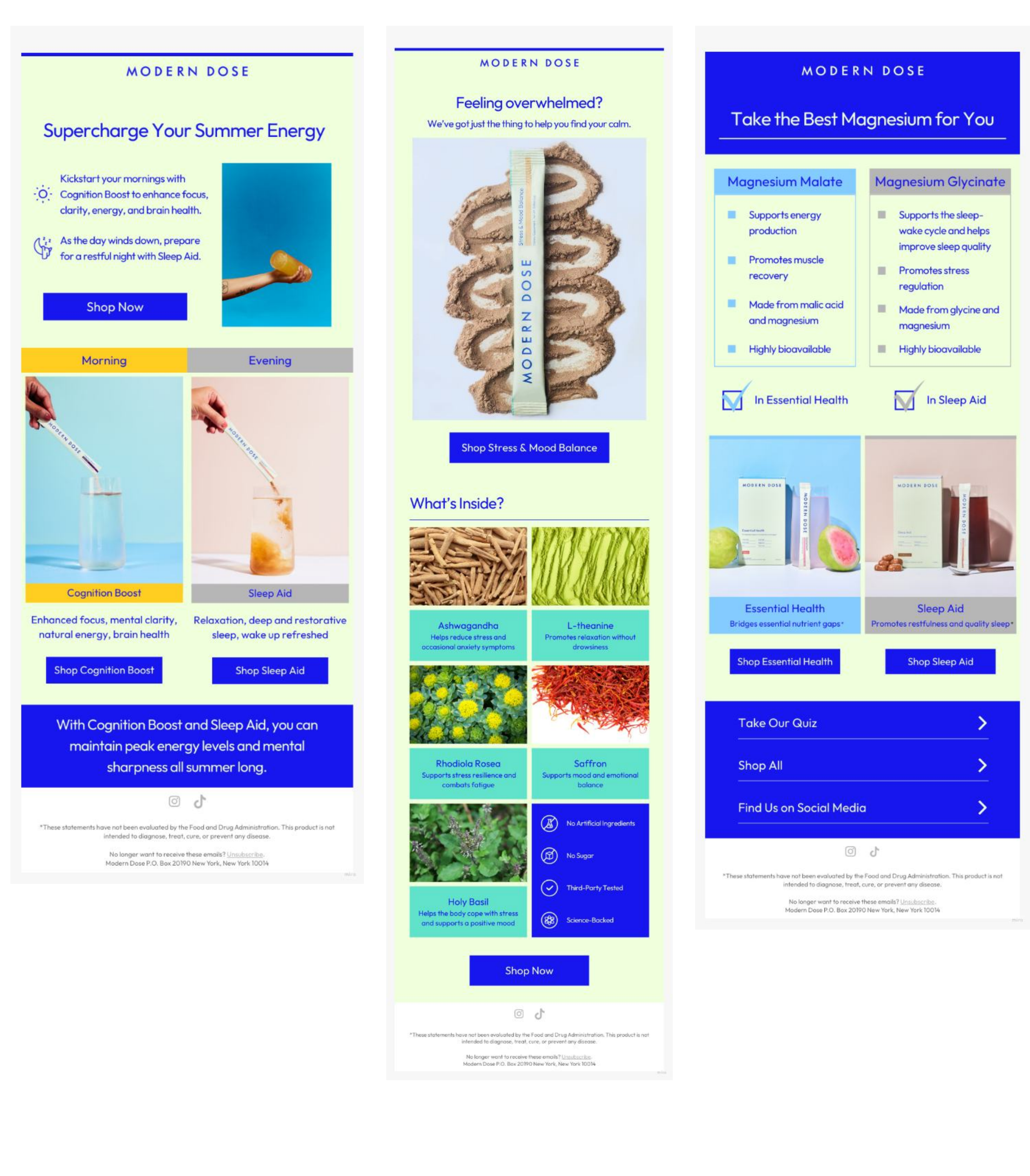
Modern Dose.
Pale green backgrounds and bold blue type tie these emails together. The layouts show three ways to present the products: a seasonal feature, a product spotlight, and a side-by-side comparison.
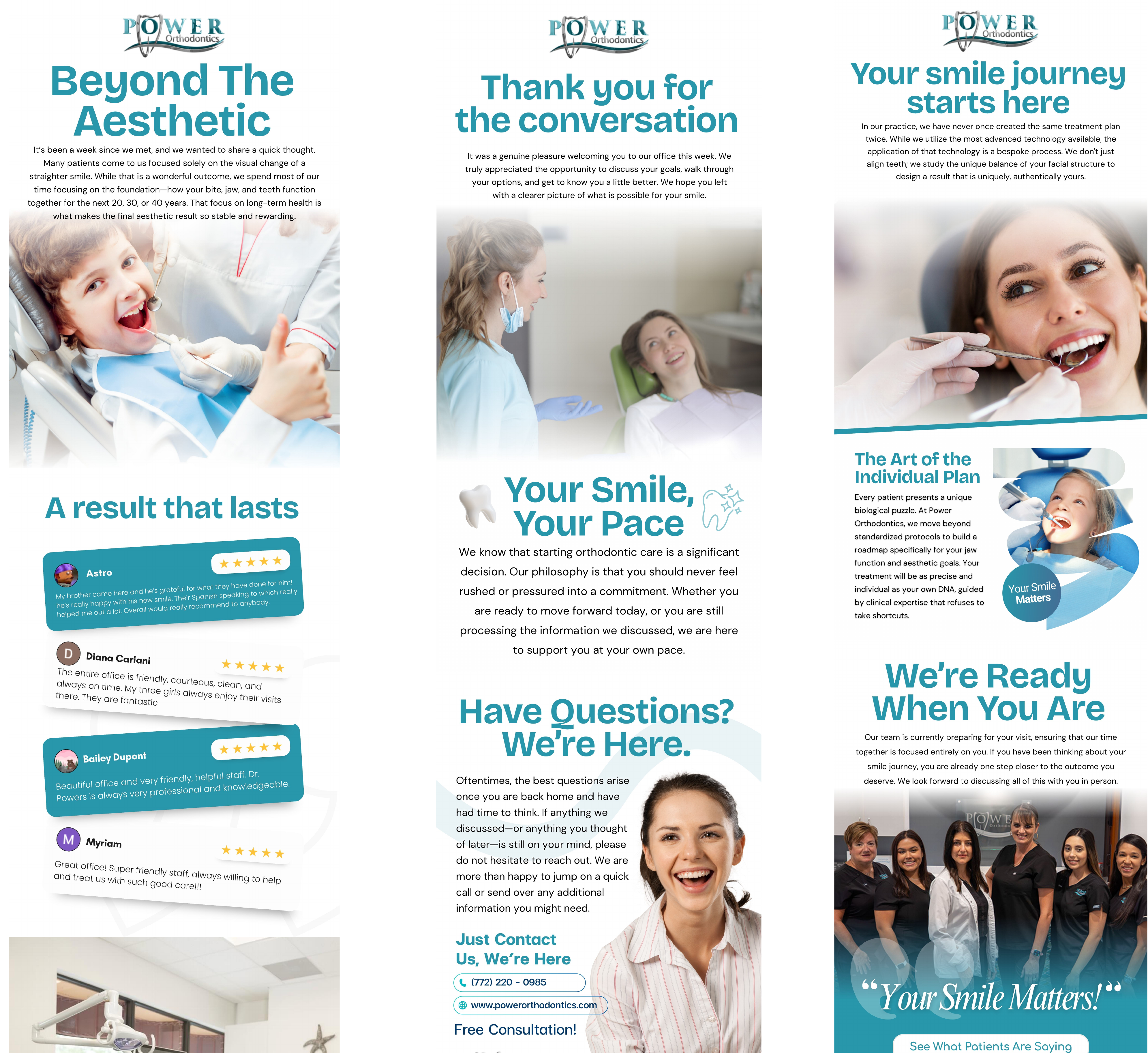
Power Orthodontics.
These emails use the practice’s teal palette, treatment imagery, and team photography. The messages introduce the practice’s approach and follow up after a consultation.
Start with what the email needs to say.
A campaign might introduce a product, explain an offer or reconnect with someone who already knows your business. The design should help the reader understand that message and decide what to do next.
Explore Email MarketingGive your emails a clearer direction.
Let’s talk about your audience, your next campaign and what you need it to do.