
A new first impression for Stuart Dental Spa.
Meet the doctor, get a feel for the office, and find out how to make an appointment. The design brings those first questions to the front of the page.
This is an unlaunched homepage proposal for Stuart Dental Spa.
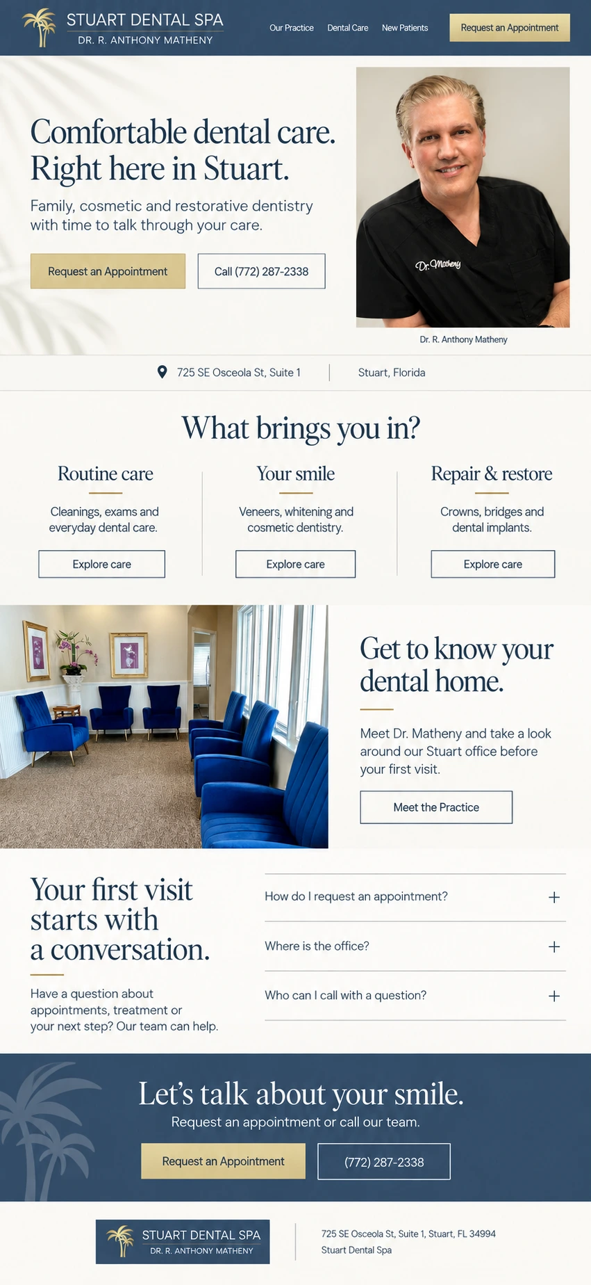
Start with what a new patient wants to know.
Who will I see? What does the office feel like? Can this practice help with what I need? The page gives those questions room alongside a clear way to request an appointment.
The practice’s own logo, Dr. Tony’s portrait, and its blue-chair lobby provide the visual references. They give the design a connection to the people and place behind the name.
Make the next step easy to find.
Appointment and phone options give visitors two clear ways to get in touch. The page keeps those choices visible while leaving room to learn about the practice first.
Give the care options some structure.
Routine care, Your smile, and Repair & restore give visitors three places to start. A questions section makes room for practical concerns about appointments and the office.
See the advertising work for this practice.
The Stuart Dental Spa advertising case study covers a separate engagement, with campaign records, reporting dates, and definitions for the results shown.
View the advertising case studyWhat should your website help people understand?
Tell me about your business and what you want to improve.